✨ Spring Color Palette Outfits
Spring Color Palette: 4 Outfit Color Combinations
Real outfit color combinations from the spring palette, with the color theory behind why each one flatters.
What is a Spring?
Spring is warm and golden. Picture morning sun on dewy skin. Soft peaches, corals, and warm yellows that look like sunrise.
If you're a Spring, your skin probably has a peachy or golden undertone, and your hair catches warm light. You glow in colors that feel alive, fresh, and a little bit playful.
Skip anything cool or muted. Burgundy, charcoal, dusty mauve — they'll make you look tired. Stay warm and clear and you'll look lit from inside.
The Spring color palette
These six shades are the Spring palette in its purest form. Every outfit on this page pulls from this exact range, which is why the looks flatter even when the color combinations sound unexpected on paper.
Color Palette
4 Spring outfit color combinations
Each combination below uses two or three colors pulled directly from the spring palette. Why these specific pairings work for Spring is explained under each one.
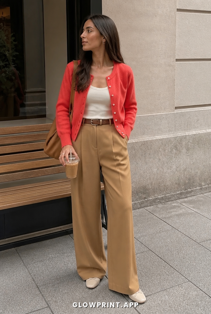
Warm Orange + Warm Tan + Cream
Warm Orange + Warm Tan + Cream is Spring compressed into one outfit. The shades share an undertone, which is why they look balanced instead of mismatched. Worn together they read as warm light brightness.
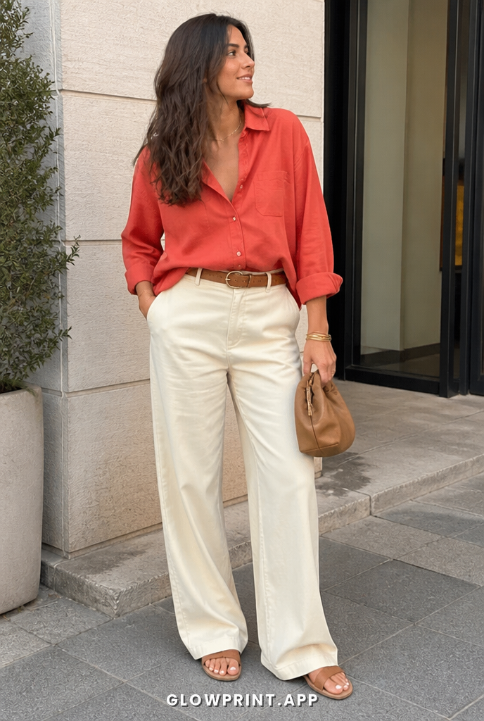
Soft Coral + Soft Orange
If you tested Soft Coral and Soft Orange side by side with anything off-palette, they would jump out as the more flattering pair. Both colors share Spring's warm undertone, and the depth gap between them lines up with the season's preferred clear contrast.
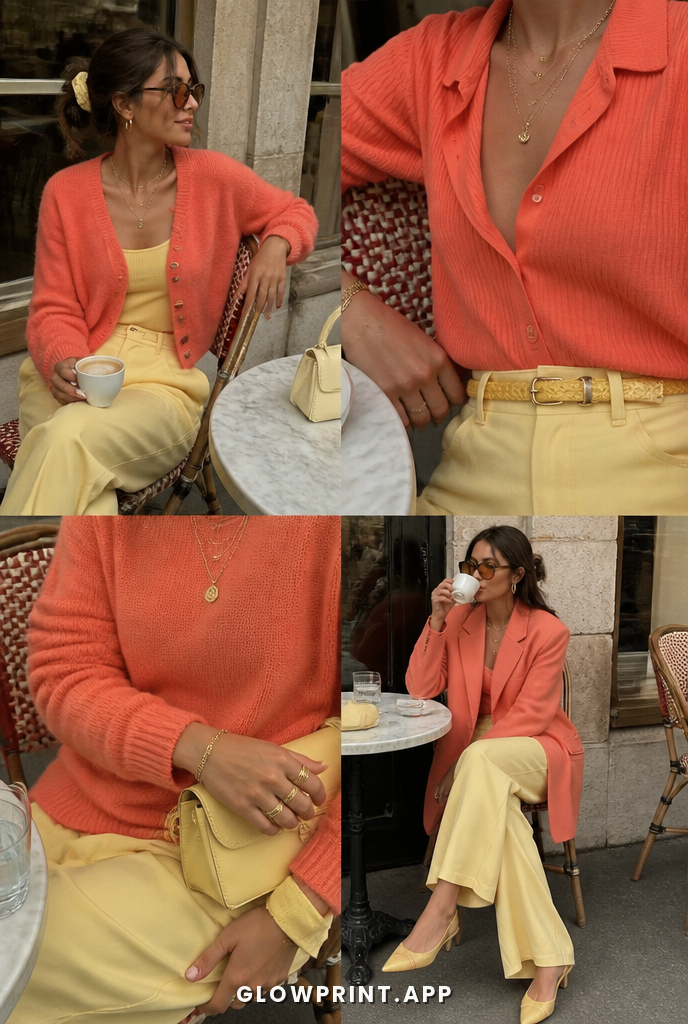
Soft Red + Soft Teal
Color theory check: Soft Red and Soft Teal are both pulled from the Spring palette, meaning they share an undertone AND a saturation level. That is the whole reason the outfit looks composed.


Your Spring capsule wardrobe
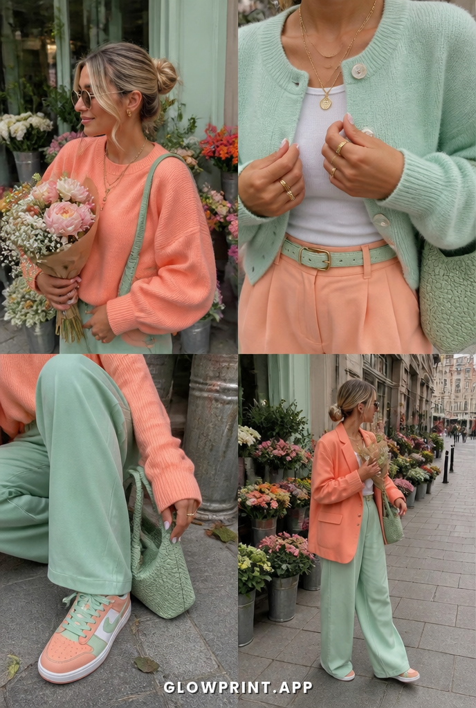
Five anchor pieces that turn the spring palette into a working wardrobe. Buy these in your palette colors and almost any combination works without effort.
- Cotton sweater, in peach, fresh green, soft red
- Linen pant, in warm cream, soft mint, warm yellow
- Silk midi, in peach, soft coral, warm yellow
- Tote, in cream, peach, soft green
- Sneaker or flat, in cream, peach, soft green
Spring color palette FAQ
The most common questions about dressing for Spring, answered in the context of color theory and not generic styling advice.
What colors should a Spring wear?
Springs wear best in colors with warm undertones, light to medium value, and clear chroma. The palette favors warm light brightness. Anything that matches that profile flatters the skin; anything that fights it (different temperature or contrast) drains the face.
What colors should a Spring avoid?
Avoid pure black, icy pastels, dusty grey. These colors fight a Spring's natural undertone and contrast level, which makes the skin look tired or washed out. The fix is sticking to the palette's clear, warm-toned range.
Can a Spring wear black?
Black is on the avoid list for Spring. It's too cool and too deep for a warm-toned, clear-chroma palette, so the face fades next to it. Swap pure black for chocolate, deep navy, or warm charcoal depending on the outfit.
How do I know if I'm a Spring?
Spring has warm undertones, light to medium natural depth, and clear chroma. If gold/silver jewelry against your skin gives you a clear answer, that's the undertone hint. For exact placement, scan your face on Glowprint. It tells you your season in 30 seconds.
What jewelry should a Spring wear?
Gold flatters Spring best because it matches the undertone of the skin and palette. Wearing the opposite metal makes the face look mismatched against the outfit.